

In the middle of Kurukshetra, there were thousands of warriors, chariots, horses, elephants, weapons and flags.
Dust rose from the battlefield. Conch shells were blown. Soldiers moved in formations. From a distance, one warrior could easily look like another. One chariot could disappear among many chariots.
But Arjuna’s chariot had something unmistakable.
On top of it flew the flag of Hanuman.
It was not just decoration. It was a sign. It told everyone whose chariot it was. It carried memory, strength, devotion and courage. It reminded the Pandavas of a larger story and a deeper protection. It also made Arjuna’s chariot recognisable in the middle of confusion.
That is the power of a symbol.
A symbol does not fight the battle by itself. But it helps people recognise who is in the battle.
Brands work in the same way.
After identity, targeting, positioning, differentiation, promise, trust, values and communication, the next important discipline in brand-building is understanding brand symbols.
A brand symbol is anything that helps people recognise, remember and associate meaning with a brand. It may be a name, logo, colour, shape, sound, tagline, packaging style, mascot, uniform, store design, or even a particular way of speaking.
Many people think symbols are superficial. They say, “Logo is not important. Product is important.” They are partly right. A logo cannot save a bad product. A beautiful package cannot hide a broken promise for long. A clever tagline cannot replace trust.
But it is also wrong to say symbols do not matter.
Symbols are the doors through which memory enters.
When people see a red and white bottle shape, they may think of Coca-Cola even before reading the name. When they see the Amul girl, they remember humour, dairy and everyday India. When they see the bitten apple, they think of design, technology and premium simplicity. When they see the Nike swoosh, they do not only see a mark. They feel movement, sport and ambition.
The symbol becomes powerful because meaning has been attached to it over time.
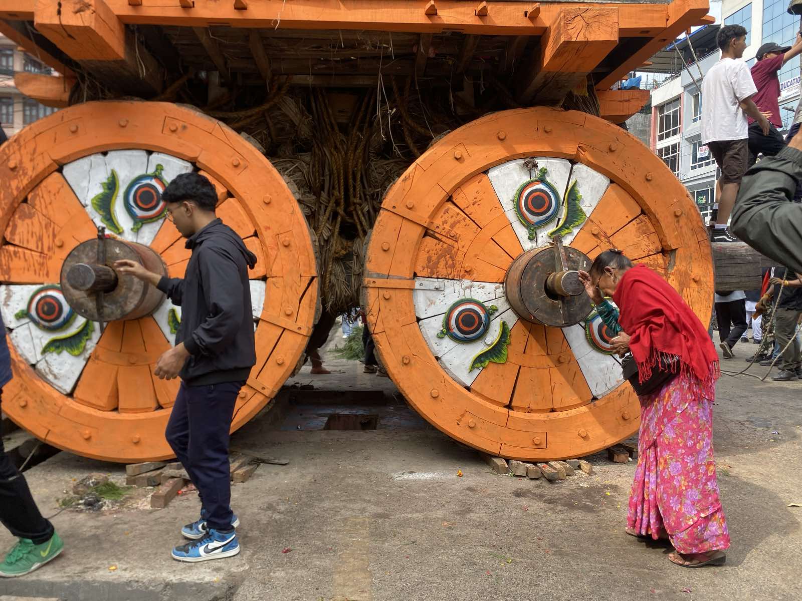
Rato Machhindranath's chariot procession begins today

In Nepal, Wai Wai’s red packaging has strong memory value. For many consumers, the colour, packet and name together create instant recognition. Goldstar’s name itself has carried a sense of local pride, durability and everyday accessibility. Even before looking at an advertisement, people carry associations in their minds.
That is what symbols do. They make a brand easier to find inside the customer’s memory.
A strong brand symbol performs three jobs.
First, it identifies the brand.
In a crowded shop, a customer does not study every packet carefully. He looks for familiar signs. A colour, logo or shape helps him quickly pick what he already knows. In a supermarket shelf, memory often works faster than rational analysis.
Second, a symbol differentiates the brand.
If every product in a category looks similar, the customer struggles. The brand becomes one among many. But when the brand has a distinct visual or verbal identity, it stands apart. Difference becomes visible.
Third, a symbol carries meaning.
This is the most important job. A logo is not only a design. A colour is not only a colour. A tagline is not only a line. Over time, they begin to carry the brand’s promise, personality and reputation.
The same colour can mean different things for different brands. Red may mean energy for one brand, love for another, urgency for another and appetite for another. Blue may suggest trust, calmness, technology or professionalism depending on the brand.
So symbols do not have fixed power by themselves. They receive power from consistent use and customer experience.
This is where many businesses make mistakes.
They keep changing their logo, colour, packaging and tagline too often. Every new manager wants a fresh look. Every new agency wants a new design. Every new campaign introduces another visual style. The company feels excited internally, but the customer’s memory gets disturbed.
A brand should evolve, but it should not become unrecognisable.
Changing a symbol is not like changing a shirt. It is closer to changing a face. If done without care, customers may feel disconnected from the brand they knew.
Sometimes change is necessary. A brand may need to look more modern, more premium or more relevant to a new generation. But even then, the change should carry continuity. The customer should feel, “Yes, this is new, but it is still the same brand I know.”
This is why good brand design respects memory.
A brand name is also a symbol.
Some names describe what the product does. Some names create emotion. Some names suggest origin, quality, speed, strength or lifestyle. A good name is easy to say, easy to remember and flexible enough to grow.
But a name alone is not enough. The behaviour of the brand fills the name with meaning.
At first, “Tata” is a surname. Over time, it becomes trust. “Amul” becomes more than dairy. “Royal Enfield” becomes more than motorcycles. “Wai Wai” becomes more than noodles.
The market gives meaning to names through repeated experience.
Taglines work in a similar way. A good tagline should not be a decorative sentence. It should express the brand’s central idea in simple language. If it sounds beautiful but says nothing specific, it becomes wallpaper.
Many brands write taglines like “Serving you better,” “Committed to excellence,” “Your trusted partner,” or “Quality you can trust.” These lines are safe, but they are also common. They do not give the customer anything memorable.
A strong tagline should sharpen the brand’s meaning.
Packaging is another powerful symbol, especially in consumer goods. For many products, packaging is the silent salesman. It speaks when the advertiser is absent. It must attract attention, create recognition, explain use and support the brand’s position.
For service brands, symbols appear in other ways: branch design, employee uniform, website layout, app interface, call centre language, business cards, proposal templates and even email signatures. All of these tell the customer something about the brand.
This is why symbols should not be treated as the designer’s responsibility alone. They are strategic assets.
A careless symbol creates confusion.
A copied symbol creates doubt.
A generic symbol creates forgetfulness.
A consistent symbol creates recognition.
But there is one warning.
A symbol should never become bigger than the substance behind it.
The flag on Arjuna’s chariot mattered because Arjuna was inside the chariot and Krishna was guiding it. If the chariot had no warrior, the flag would have been only cloth.
Brands must remember this.
A logo becomes powerful only when the product, people and promise support it. A tagline becomes powerful only when behaviour proves it. A colour becomes powerful only when repeated experience gives it meaning.
In the marketplace, customers are surrounded by thousands of signs. Names, colours, designs, icons, reels, banners, jingles and packaging fight for their attention every day.
The brand that builds clear and consistent symbols has an advantage. It becomes easier to recognise, easier to recall and easier to trust.
In Kurukshetra, the flag helped people identify the chariot.
In the marketplace, brand symbols help people identify meaning.
Brand Neeti
A brand symbol is not decoration. It is a memory device. When used clearly and consistently, it helps customers recognise, remember and attach meaning to the brand.