Saturday, 20 April 2024 06:34 PM
OR
Login using
Choosing the right color for your décor
If you are planning on painting your home or office space, there are a lot more things you should consider than just your favorite color. While most of us think that the sole purpose of painting is purely for decorative purposes, we overlook the fact that the colors affect our moods. Color psychology is a much studied subject that has consistently proven the fact that different colors affect us in different ways and have an influence on how we feel and act.
Yellow
Yellow is a rather divisive color; people either love it or hate it. Those who love it describe it as optimistic and happy, while those who hate it find it a bit too intense. Use this color depending on your personal preference.
Muted shades of yellow can be used on walls and ceilings to add warmth to a room, while more intense shades of yellow can be used to add a pop of color to an otherwise subdued decor. Though a cheery color, it is not a good choice for main color schemes. Studies show that people are more likely to lose their temper in a yellow interior. Babies also seem to cry more in yellow rooms. In large amounts, this color tends to create feelings of frustration and anger. Use it sparingly in the rooms that don’t get sunlight. Although many are hesitant to use yellow on an entire wall, a pop of bright yellow in your décor – yellow accessories, flowers, accent furniture – can add a much needed vibrancy to the room.
Green
A very calming and reassuring color, green, on a subconscious level, represents a warm, fertile environment with access to water – a good environment for survival. Hence, it often makes us feel safe. They color green is best used to create a calm and relaxing environment.
In interior décor, green is most effective when different shades of green are combined, or green is combined with other shades of colors to create a more complex and nuanced environment. Green often goes best with blue, red and neutral shades. It is a color that is suited for almost any room on the house; in the kitchen, green cools things down; in the family room, it encourages unwinding but has enough warmth to promote the feeling of comfort and togetherness.
Blue
A neutral color, blue is almost universally liked. It is very cool and calming and hence apparently reduces heart rate and blood pressure. Often recommended for bedrooms and bathrooms, blue can improve mental clarity, inspire creativity and instill trust. Light shades of blue can be used to “expand” a room and make it look bigger than it actually is and can be used to create a reflective and spiritual environment.
Blue can make a hot sunny room feel cooler. However, blue walls and ceiling in a room that receives little to no sunlight can give the room a chilly, wintry feel.
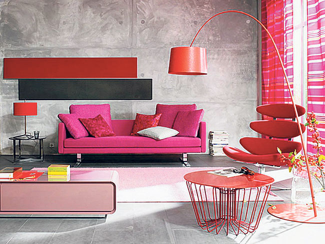
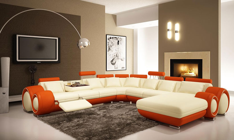
Red
A vibrant color, red has stimulating effects on our mind. Often associated with threat, the color red can increase the heart rate and blood flow through the body. In a professional setting, it can be used to create a dynamic and stimulating environment. Muted shades of red, on the other hand, are associated with warmth and comfort and can be used for creating a cozy setting.
In the living room or dining room, red draws people together and stimulates conversation. In an entryway, it creates a strong first impression. It is usually considered too stimulating for bedrooms, but if you’re typically in the room only after dark, you’ll be seeing it mostly by lamplight, when the color will appear muted, rich and elegant. Red is also particularly known for stimulating one’s appetite and is very popular within the food industry. Many interior designers suggest using the color red on your kitchens and dining rooms.
Purple
Purple is often considered the color of royalty as, for a long time in history, the color was simply too expensive for the general masses to afford. The color is still associated with luxury, even today. The psychological effect of a shade of purple depends on whether the shade is on the more reddish or more bluish end of the spectrum. A bluish purple gives off a calm, serene and slightly mysterious vibe. It can add character and depth to the room whereas a reddish purple is very dominating and commands attention. Reddish purple can also run the risk of appearing tasteless and gaudy. Lighter versions of purple, such as lavender and lilac, bring the same restful quality to bedrooms as blue does, but without the risk of feeling chilly.
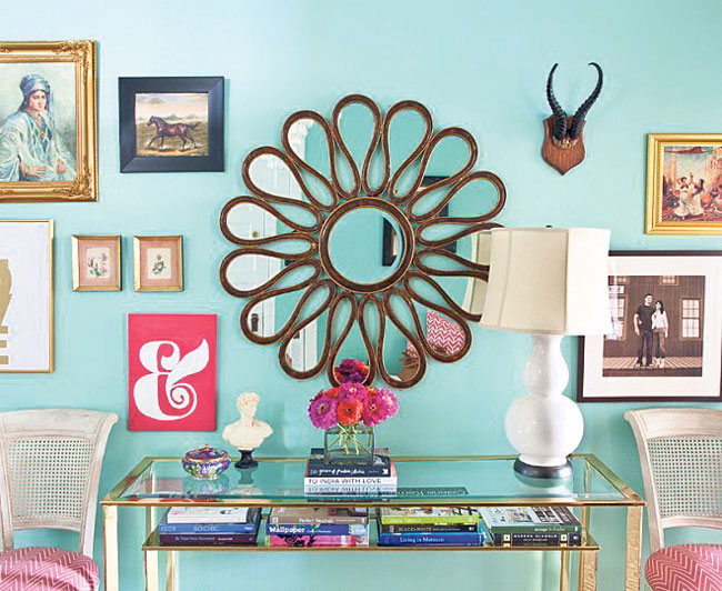
White
The color white is often associated with different meanings according to individual cultures. But when it comes to décor, white tends to add an air of purity and crisp freshness. Being an exceptionally bright color, white also creates an illusion of space, making a room seem much larger than it really is.
A completely white décor can often seem rather stark and sterile, hence it needs additional tints of color and textures to make it seem softer and more inviting. As a neutral color, white goes well with most other colors. You can pair it up with other neutrals like browns, grays and earthy tones for a more muted environment or add some red or yellow for a pop of color. You can paint any room of your house white and play with different shades of other colors to add some warmth.
 Interior Designer Lasata Shrestha says that color choices are highly subjective and personal when it comes to decorating your space. If you feel right about a color you should go for it, regardless of the conventional rules you are expected to follow. You should however pick a color palette and stick to it. You can choose different shades of the same color and play on chromatic colors or stick to the black and white monochrome. However, she says, there are a few things you need to consider before you pick up the paint brushes.
Colors
A room should have about three to five colors which should include one bright color, one light color and one dark color. If the room is small, paint it white or soft neutrals to make it look bigger.
Proportions
“The formula 30-60-10 never goes wrong while balancing the color proportions of your home,” she said. 60 percent is the dominant hue on the wall, 30 percent is the complementary colors applied in furnishing and 10 percent is the infusion of colors through with the use of various decorative items like lamps, pillows, artwork or area rug.
Lighting
“The amount of natural light the room gets and the size of the room needs to be considered while selecting the color palette,” she said. You should use warm colors in a room that receive minimum amount of sunlight and a lighter color in a room that receives harsh sunlight.
You May Like This

Alfesco Open Art Exhibition begins at Nepal Art Council
KATHMANDU, Feb 14: Alfresco Media and Event organized ‘Alfresco Open Art Exhibition and Competition 2017’ for pre-primary level to college level... Read More...

Seventh National Fine Art Exhibition: Widening scope of arts
The Seventh National Fine Art Exhibition organized by Nepal Academy of Fine Arts has been shown from June 19 –... Read More...

A German artist turns Kathmandu’s trash into art
KATHMANDU, Sept 7: One man’s trash is another man’s treasure. For German artist Lena Koester, Kathmandu’s everyday trash is her inspiration... Read More...


_20220508065243.jpg)


Rainbow tourism int'l conference kicks off
4 minutes ago


Kushal Dixit selected for London Marathon
4 hours ago


Just In
- Rainbow tourism int'l conference kicks off
- Over 200,000 devotees throng Maha Kumbha Mela at Barahakshetra
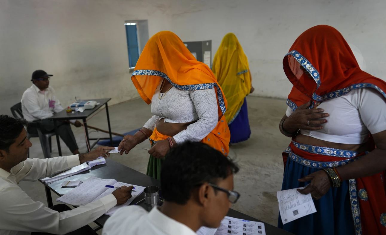
- Indians vote in the first phase of the world’s largest election as Modi seeks a third term
- Kushal Dixit selected for London Marathon
- Nepal faces Hong Kong today for ACC Emerging Teams Asia Cup
- 286 new industries registered in Nepal in first nine months of current FY, attracting Rs 165 billion investment
- UML's National Convention Representatives Council meeting today
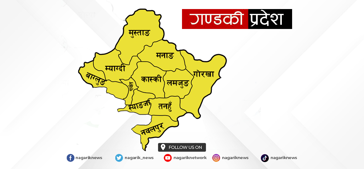
- Gandaki Province CM assigns ministerial portfolios to Hari Bahadur Chuman and Deepak Manange
Leave A Comment