Thursday, 25 April 2024 07:34 PM
OR
Login using
Infographics: Effects of global warming
Published On: November 1, 2018 12:05 AM NPT By: Republica | @RepublicaNepal
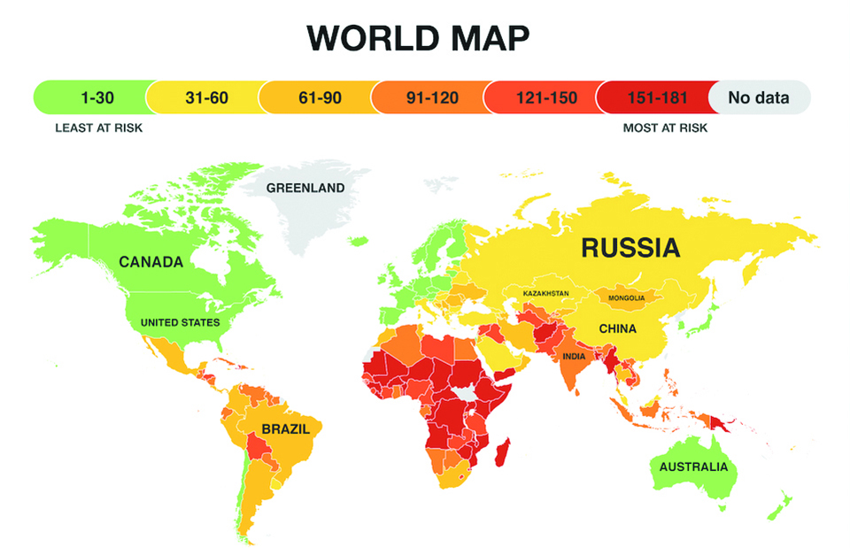
According to climate scientists and urban planners, that doesn’t leave a lot of options. “The bottom line is it’s going to be bad everywhere,” Bruce Riordan, the director of the Climate Readiness Institute at the University of California, Berkeley, told Business Insider. “It’s a matter of who gets organized around this.” That said, some countries will fare far better than others, according to UK-based energy comparison service Eco Experts, which created a color-coded map using data from the Notre Dame Global Adaptation Index. The index analyses 181 countries based on factors like healthcare, food supply, and government stability and ranks them on their ability to cope with the challenges posed by a warming planet. Norway ranked #1, while a handful of other Nordic countries (and New Zealand) followed. A safe haven sounds like a good idea right about now.
Somewhere that’s warm but not too warm, free from roof-toppling hurricanes and close to a river or ocean but far enough to avoid the threats of flooding and sea-level rise. While the maps provide a great zoomed-out perspective of what will happen globally as the earth warms, there are a couple caveats to keep in mind when checking it out: The map looks only at country-level data, not at states, regions, or cities. While the US gets a green light on this map, many cities within its borders are poorly prepared for climate change. Developed countries in general have larger budgets and more infrastructure to work with, automatically shifting them toward the top of the list while lower-income countries are shuffled down.

You May Like This

Infographics: Republica Infographics
KATHMANDU, Jan 9: US AID to Pakistan has been dropping ... Read More...
Infographics: Republica Infographics
South Korea offers Jan. 9 Olympic talks with North Korea ... Read More...
Infographics: Republica Infographics
Infographics ... Read More...


Pak Embassy awards scholarships to 180 Nepali students
23 minutes ago


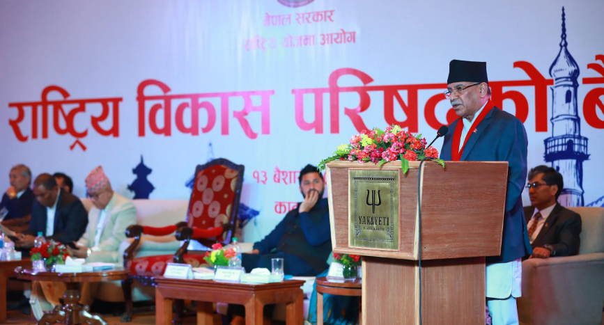
Karnali CM Kandel secures vote of confidence
2 hours ago
Just In
- NEPSE loses 3.24 points, while daily turnover inclines to Rs 2.36 billion
- Pak Embassy awards scholarships to 180 Nepali students
- President Paudel approves mobilization of army personnel for by-elections security
- Bhajang and Ilam by-elections: 69 polling stations classified as ‘highly sensitive’
- Karnali CM Kandel secures vote of confidence
- National Youth Scientists Conference to be organized in Surkhet
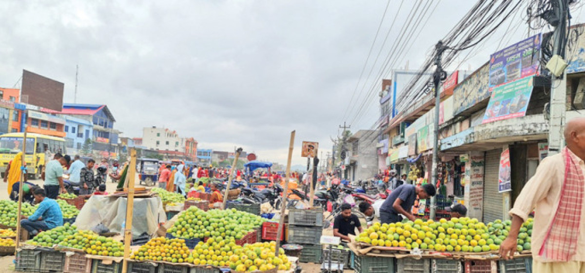
- Rautahat traders call for extended night market hours amid summer heat
- Resignation of JSP minister rejected in Lumbini province
Leave A Comment